GRAPHING
PURPOSE
The purpose of this experiment are to learn how
to graphically represent data from an experiment and perform a linear regression.
DISCUSSION
I. Introduction
A properly constructed graph of experimental
data is a very effective device for observing trends, discovering relationships,
or predicting information.
II. Important Terms
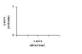
A. Perpendicular Axes (see figure)
1. The vertical axis (the y-axis) is the ordinate
2. The horizontal axis (the x-axis) is
the abscissa.
B. Variables
1. The independent variable is the quantity that is deliberately varied or changed. The independent variable is plotted on the x-axis.
2. The dependent variable is the quantity that
changes due to the variation in the independent variable. The dependent
variable is plotted on the y-axis.
C. Origin
1. The location on the graph where x = 0 and y = 0.
2. The origin is most commonly found at the lower left corner of the graph.
3. Not every graph will have an origin, (0,0
point). The values to be plotted on the graph will be the determining factor
here.
D. Intercept
1. The intercept is the location on the graph where a line through the data crosses one of the axis.
2. If the graph line crosses the y-axis,
this point is called the y-intercept, (most common). If the line
crosses the x-axis (occasionally observed) this point would be referred
to as the x-intercept.
E. Line of Best Fit
1. Often, the graphical relationship between the dependent and independent variables produces a straight line. In such cases, a line corresponding to the best fit of the data points is drawn, using a straight edge (ruler).
2. The line of best fit on a graph rarely (if ever) goes through each plotted point. Usually, some of the points are above the line and an approximate equal number of points are below the line. See graph.
3. Algebraically, a straight line is described
by the equation: ![]() .
Where
.
Where
m = the slope of the straight line
b = the point on the y-axis, where
the line intersects, when x=0.
F. Slope
1. The slope of a straight line is the ratio of the change of the dependent variable to the change of the independent variable.
2. The slope (m) of the best straight
line is determined from the relationship ![]()
3. It is important to select two widely separated locations on the drawn line of best fit to represent (x1,y1) and (x2,y2). Identify positions by drawing appropriate slope lines. It is advantageous to choose points on the drawn line that correspond to convenient (easily read) values along the x and y- axis.
4. The slope calculation set-up and the answer
with desired units should be shown on the graph. (See graph on previous
page.)
G. Graph Interpretation
1. Interpolation is the determination of a value for a variable read from the graph between data points. The desired value is found within the range of the graph.
2. Extrapolation of a value requires reading
a graph beyond the limits of the experimentally determined data points
III. Graph Construction
A. Select the Axis
1. Determine the dependent and independent variables.
2. Each axis should be labeled around the midpoint with the appropriate variable and units of measurement (e.g., Volume (ml)).
Note: If you are instructed to plot some variable as a function of or versus another variable, the variable listed first is the dependent variable.
For example: "Plot pressure as a function
of Volume," or "Plot pressure vs. Volume". In this example,
pressure is the dependent variable.
B. Set the scales for the axis
1. Use as much of the space on the graph paper as possible.
2. Choose scales for the x and y axis that cover the range of the experimental data. Generally, it is not appropriate to use the plotted data values as your scale.
3. When choosing the scale, always choose values for the major divisions that make the smaller subdivisions easy to interpret . The scale is always developed in an increasing order.
4. Each scale should be broken up into between
5 to 12 intervals. It is vital that the scale be consistent and even.
C. Plot the data
1. If two or more different data sets are plotted
on the same graph, use a different symbol (triangle, square, diamond) around
the data point to distinguish one set of data from another.
D. Draw a line or curve for the best fit.
1. If the plotted points appear to lie in a straight line draw a smooth line-of-best-fit. Warning: It is totally unacceptable to ever draw a series of straight line segments from point to point. (Don't connect the dots.)
2. If the data do not appear to lie along a straight
line, but do seem to lie along a smooth curve, draw a smooth curve that
best fits your data. Remember, just as with the line of best fit, the curve
should pass as close as possible to the points, having plotted data points
above and below the curve.
E. Label your graph.
- Place a descriptive title in the upper portion of the graph.
- All words in the title except for articles and prepositions should be capitalized.
IV. Procedure A - Constructing a Graph
Construct separate graphs for the following data. If the plotted data
appears to be a straight line graph, determine the slope of the best
fitting line.
- Potassium nitrate solubility as a function of temperature.
|
Solubility (g/100g water) |
13 |
21 |
32 |
46 |
64 |
86 |
110 |
138 |
|
Temperature (oC) |
0 |
10 |
20 |
30 |
40 |
50 |
60 |
70 |
- Voltage versus current for a tungsten filament.
| E (volt) | 0.79 | 1.57 | 2.35 | 3.18 | 3.91 | 4.68 | 5.48 | 6.26 |
| I (amp) | 0.0100 | 0.0200 | 0.0300 | 0.0400 | 0.0500 | 0.0600 | 0.0700 | 0.0800 |
- Plot volume versus pressure
| P (atm) | 1.000 | 0.667 | 0.500 | 0.333 | 0.250 | 0.167 |
| V (L) | 0.506 | 0.761 | 1.015 | 1.524 | 2.034 | 3.052 |
V. Procedure B - Computer Graphing
An alternative to graphing data manually is computer generated graphing using spreadsheets. The following set of instructions is to familiarize you with the Quattro Spreadsheet. Follow the instructions provided below.
The graphing procedures above can be used for a variety of different applications. Practice with the basic tools and processes in this lab will make spreadsheet use an important part of your computer knowledge.